← Back to Kraemon

Themes & Personalisation

Make it yours.

Six colour themes. Three background textures. Your revision app, styled the way you want it — because you're more likely to open an app you actually like the look of.

Six themes, one tap to switch

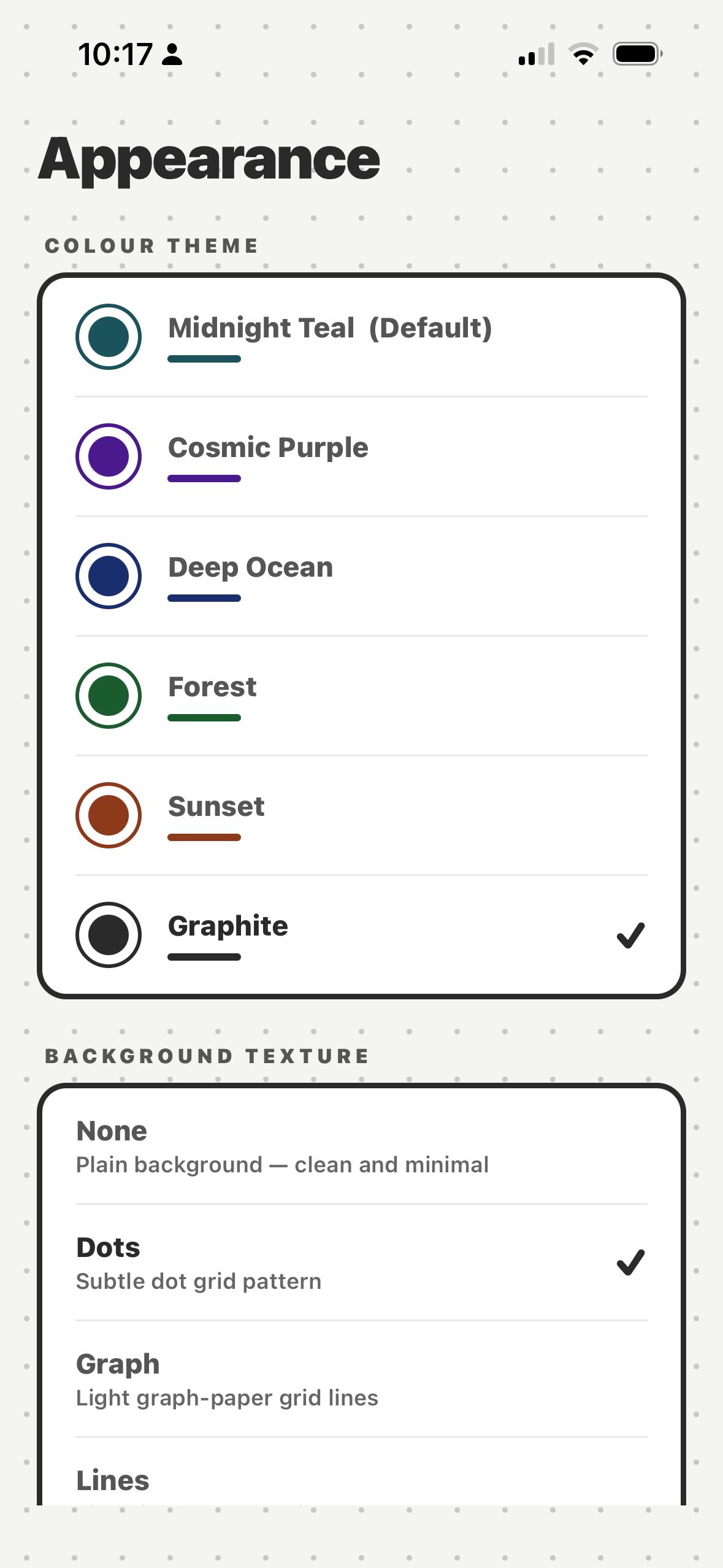
Kraemon ships with six colour themes — each a complete palette covering backgrounds, text, accents, and UI elements. Switch theme at any time from Settings, with a live preview before you commit.

Themes aren't just cosmetic. A consistent visual environment can help build the psychological association between opening Kraemon and settling into revision mode — a small but real benefit for habit formation.

  • Teal — the original (default)
  • Purple — deep violet tones
  • Ocean — blue-green cool tones
  • Forest — earthy greens
  • Sunset — warm amber and coral
  • Graphite — neutral dark UI
Kraemon theme picker
Background textures
None (clean)
Dots
Graph
Diagonal

Background textures

On top of your chosen colour theme, you can add a subtle background texture — dots, a graph-paper grid, or diagonal lines. The textures are intentionally subtle, adding depth without distracting from the content.

Choose "None" if you prefer a clean, flat look. All combinations of theme and texture work together — there are 24 possible combinations and none of them look bad.

  • None — clean, minimal (default)
  • Dots — subtle dot grid
  • Graph — fine graph-paper lines
  • Diagonal — hatched line pattern
  • Persists across app restarts
  • Changed in Settings → Appearance

Revision that looks good.

Kraemon is coming soon — get notified when it launches.

Get notified →